WEEK 5AND 6 STATISTICS
FREQUENCY TABLE
EXAMPLE 1: The following figures show the number of children per family in a sample of 40 household. 1, 2, 4, 3, 5, 3, 8, 3, 2, 3, 4, 5, 6, 5, 4, 2, 1, 3, 2, 4, 5, 3, 8, 7, 6, 5, 4, 5, 7, 6, 3, 8, 6, 3, 5, 7, 5, 4, 3.
- Use a tally mark to prepare a frequency table for the data
- What is the highest frequency of numbers of children per family?
![]()
![]() Solution
Solution
![]() NUMBER TALLY FREQUENCY
NUMBER TALLY FREQUENCY
1 // 2
2 //// 5
![]() 3 //// //// 9
3 //// //// 9
![]() 4 //// / 6
4 //// / 6
![]() 5 //// /// 8
5 //// /// 8
6 //// 4
7 /// 3
![]() 8 /// 3
8 /// 3
![]() 40
40
3 is the highest frequency of numbers of children
Example 2: In a further mathematics test the following marks were obtained by a group of students 85, 75, 95, 80, 75, 80, 90, 84, 95, 84, 85, 80, 80, 75, 80, 75, 80, 84, 81, 80, 75, 90, 80.
Use tally mark to prepare a frequency table for this data.
![]() Solution:
Solution:
![]()
![]() NUMBER TALLY FREQUENCY
NUMBER TALLY FREQUENCY
![]() 75 //// 5
75 //// 5
![]() 80 //// 9
80 //// 9
81 / 1
84 /// 3
85 // 2
90 /// 3
95 // 2
- How many students took part in the test? 25 students
- Which mark had the highest frequency? 80 marks
AVERAGE, MEAN MEDIAN AND MODE
Average is a single value used to represent a set of numbers (i.e all value in as et data)
The most common ly used statistics is average.
MEDIAN = THE NUMBER AT THE MIDDLE AFTER THE ARRANGEMENT OF THE DATA.
MODE IS THE VALUE THAT OCCURS MOST FREQUENTLY.
EXAMPLES: Calculate the mean, media and mode of the following data
- 45, 50, 55, 54, 48, 53, 50, 55
- 38, 35, 36, 30.8, 34.7, 37.9, 33.1
- 3, 0,4,7, 0, 5, 3, 4, 0, 3, 6, 5, 5 ,4, 6, 5
Solution:
Mean = 45+50+ 55+ 54+ 48+ 53+ 50+ 55
8
= 410/8
= 51.25
Median = 45, 48, 50, 50, 53, 54, 55,55
50 + 53
2
= 52
Mode = 50 and 55
Average
The average or mean of a set of numbers is defined by the formula:

Example
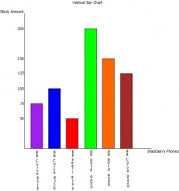
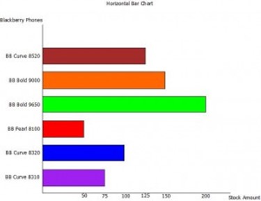
Bar Charts
A Bar chart is a series of rectangular bars of the same width, drawn vertically or horizontally, with an equal space between them, with the height of each bar being a depiction of the data it is representing.
Example
The table below lists several models of Blackberry cellular phones and the amount of each that an electronic store has in stock. Draw a vertical and horizontal bar chart to represent the data.
| Blackberry Phones | Stock Amount |
| Blackberry Curve 8310 | 75 |
| Blackberry Curve 8320 | 100 |
| Blackberry Pearl 8100 | 50 |
| Blackberry Bold 9650 | 200 |
| Blackberry Bold 9000 | 150 |
| Blackberry Curve 8520 | 125 |
Pie Charts
A Pie chart is a circular diagram divided into sectors, with the size of each sector representing the magnitude of data it is depicting. Each sector of a pie chart can either be displayed in percentages (note all sectors must add up to 100%) or as an angle (note all sectors must add up to 360o).
Example
The table below lists some of the most popular football clubs and the number of students at a given institution that supports each. Use a Pie chart to represent the information given in the table.
| Football Clubs | Number of Students |
| Chelsea | 50 |
| Manchester United | 200 |
| Barcelona | 350 |
| Real Madrid | 150 |
| Inter Milan | 25 |
| Arsenal | 100 |
| Liverpool | 40 |
| AC Milan | 75 |
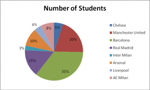
The Pie Chart above depicts each sector as percentages. To calculate the percentages for each sector use the formula below:
% of a sector = Number of students x 100
Total number of students
So, to calculate the percentage of Chelsea fans:
% of Chelsea fans = 50 x 100
990
% of Chelsea fans = 5%
For Pie charts which depicts each sector as angles, the angles for each sector is found using the formula below:
Angle of a sector = Number of students x 360
Total number of students
So, to calculate the angle of the Chelsea sector:
Angle of Chelsea sector = 50 x 360
990
Angle of Chelsea sector = 18o
Note: In most cases the questions set on Pie charts require those drawn depicting sectors in percentages.
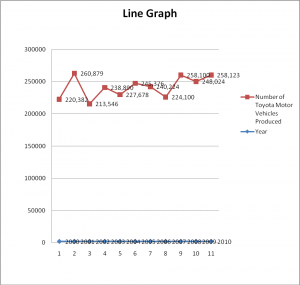
Line Graphs
Line graphs are mostly used in depicting trends, and as such, values are in most cases plotted against time. A line graph is drawn by connecting a line to consecutive values, with a circle/point made at each value being depicted.
Example
The table below lists the amount of Toyota motor vehicles produced in the month of April over the period 2000- 2010.
| Year | Number of Toyota Motor Vehicles Produced |
| 2000 | 220,382 |
| 2001 | 260,879 |
| 2002 | 213,546 |
| 2003 | 238,890 |
| 2004 | 227,678 |
| 2005 | 245,376 |
| 2006 | 240,224 |
| 2007 | 224,100 |
| 2008 | 258,100 |
| 2009 | 248,024 |
| 2010 | 249,123 |