WEEK 8
EVERYDAY STATISTICS
Data Presentation
Frequency Table
Example: The raw data below show the number of mobile phone calls made by a group of students in a certain day.
5 6 7 8 4 4 5 7 8 10
7 6 5 8 5 7 8 7 10 7
6 5 6 7 7 5 4 5 7 8
- Use a tally mark to prepare a frequency table for this data
- What calls occur most often?
- What percentage of students made 8 calls?
SOLUTION


 No of calls made Tally Frequency
4 3

 5 7
5 7


 6 4
6 4

 7 9
7 9
 8 5
8 5
 9 0
9 0
10 2- 7 calls
- x 100
= 16%
Pictogram
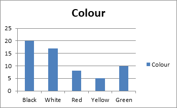
Example: The following table shows the colour of cars in a car park one morning. Draw pictogram to illustrate this data.
![]()
![]() Colours of car frequency
Colours of car frequency
Black 20
White 17
Red 8
Yellow 5
Green 10
SOLUTION
Colour of cars
![]()
![]()
![]()
![]()
![]()
![]()
![]()
![]()
![]()
![]() Black
Black
![]()
![]()
![]()
![]()
![]()
![]()
![]()
![]()
![]() White
White
![]()
![]()
![]()
![]() Red
Red
![]()
![]()
![]() Yellow
Yellow
![]()
![]()
![]()
![]()
![]() Green
Green
![]()
![]() Key: = 2 = 1
Key: = 2 = 1
Bar Chart
Bar charts consist of series of bars with equal width.
Example: Draw bar chart to illustrate the data of the example above
Frequency colour of cars of the park
Compound bar chart
It is used to compare two or more different sets of information.
Example:
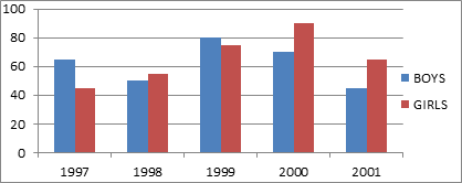
 The following table shows the number of candidates who gained admission into higher institutions at a certain town over a period of years.
Year Boys Girls
1997 65 46
1998 50 55
1999 80 73
2000 70 92
2001 45 64
- Illustrate this information on dual bar chart
- Illustrate what year did girls leave the highest admission?
- Illustrate what year did boys have the least admission?
- How many more boys had admission than girls in 1999?
- How many more candidates gained admission in 2000 than 1998?
SOLUTION
No of candidates
ASSIGNMENT
EXERCISE 22.1; NO 1, 2, AND 3 PAGE 226.
Pie charts
A pie chart is a circle divided into sectors whose angle are used to display data
Example:
- In a certain year, the expenditure of a university is shown in the table below.

 Items Expenditure in Million Naira
Equipment 20
Salaries and wages 25
Building projects 70
Maintenance 25
Miscellaneous 10 - Draw a pie chart to illustrate the information
- What percentage of total expenditure goes on project
![]()
![]() SOLUTION
SOLUTION
![]() Items Expenditure in Million Naira Angles
Items Expenditure in Million Naira Angles
Equipment 20 x = 48o
![]()
![]() Salaries and wages 25 x = 60o
Salaries and wages 25 x = 60o
![]() Building Project 70 x = 168o
Building Project 70 x = 168o
![]() Maintenance 25 x = 60o
Maintenance 25 x = 60o
![]() Miscellaneous 10 x = 24o
Miscellaneous 10 x = 24o
Total 150 360o
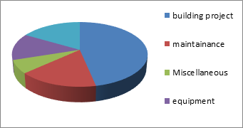
b) x = 46.7o
Example 2
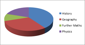
History 40% , Geography 30% , Further Mathematicss10% and Physics 20%
The pie chart shows the percentage of students taking Further Mathematics, Physics, History and Geography
- What angle represented subject?
- What fraction of students are taking history
 If the total number of students is 500, how many students are taking physics?
![]() SOLUTION
SOLUTION
![]() Subject Percentage Angles
Subject Percentage Angles
![]() Further Maths 10% x = 36o
Further Maths 10% x = 36o
![]() Physics 20% x = 72o
Physics 20% x = 72o
![]() History 40% x = 144o
History 40% x = 144o
![]() Geography 30% x = 108o
Geography 30% x = 108o
Total 100% 360o
(b) Fraction for history = =
(c) No of Physics Students = x 500 = 100 Students
Exercise: Ex. 22.2 No 1 and 5 page 228 and 229
WEEK 9
MEASURE OF CENTRAL TENDENCY (MEAN, MEDIAN, MODE)
Example
- In a test 10 pupils obtained the following marks 5, 7, 4, 8, 5, 7, 10, 9, 3. Find (a) The mean mark (b) Median mark (c) Modal mark.
SOLUTION
- Mean = = =
Mean = 6.4
- Arrange the marks in ascending order of magnitude 3, 4, 5, 5, 6, 7, 8, 9, 10
Median = = = 6.5
- The mode is the value that occurs most the mode are 5 and 7 this is bimodal.
Calculating average from frequency tables
Examples: In a science test. The following score shown in the table below were obtained out of 10 by some students.
![]()
![]() Marks No of Students (Frequency)
Marks No of Students (Frequency)
0 2
1 1
2 2
3 4
5 1
6 7
7 3
8 4
9 1
- Find (i) the mode (ii) the median (iii) the mean of the frequency distribution
- How many students scored at least 5 marks
SOLUTION
- (i) Mode = 8
(ii) 0, 0, 1, 2, 2, 3, 4, 4, 5, 6, 6, 7, 7, 7, 8, 8, 8, 8, 9
Median = = 5.5
(iii) Sum of values = 0 + 0 + 1 + 2 + 2 + 3 + 4 + 4 + 5 + 6 + 6 + 7 + 7 + 7 + 8 + 8 + 8 + 8 + 9 = 99
Mean = = = 4.95
ALTERNATIVELY
![]()
![]()
![]() Scores frequency (f) frequency x score
Scores frequency (f) frequency x score
![]() 0 2 2 x 0 = 0
0 2 2 x 0 = 0
![]() 1 1 1 x 1 = 1
1 1 1 x 1 = 1
![]()
![]()
![]()
![]()
![]()
![]()
![]() 2 2 2 x 2 = 4
2 2 2 x 2 = 4
3 1 1x 3 = 9
4 3 3 x 4 = 12
5 1 1 x 5= 5
6 2 2 x 6 = 12
7 3 3 x 7 = 21
8 4 4 x 8 = 32
![]() 9 1 1 x 9 = 99
9 1 1 x 9 = 99
= 20 = 99
Mean = = = 4.95
Exercise: Ex 22.3 No 1 and 2 page 231
Range: It gives a measure of how spread and the values are. Range = Highest value – Lowest value
Examples
- Find the range of these numbers 9, 4, 7, 6, 12, 8, 15, 10
Solution: Range = 15 – 4 = 11
- A student obtained the following marks each out of 100 in different geography test 42, 44, 50 40, 54, 48, 10 88. Find (a) The mean (b) the range (c) make a comment why the range in this case is not good to measure the spread.
SOLUTION
- Mean = =
Mean = 48
- Range = 88 – 10
= 78
- The two extreme values i.e. 10 and 88 affects the range, so at it not a good measure of spread in this particular case.
Exercise
Find the range of the following
- 35cm, 50cm, 45cm, 90cm, 30cm
- 67km, 50km, 20km, 48km, 55km
- 5.2, 4.7, 8.2, 9.3, 6.4, 5.5
ASSIGNMENT
EXERCISE 22.4; NO 8, 9 AND 10. PAGE 240.