WEEK TEN
TOPIC: Statistical Graphs
CONTENTS:
Drawing of bar chart, pie-chart and histogram
Cumulative frequency curve
Reading and drawing inferences from the graph
Graphical Presentation of data; the diagrammatic representation of collected data is known as the graphical presentation. Statistical data is interpret from graphs, than the use of frequency distribution table, as the graphs give a very clear pictures of data. There are various diagrams or graphs associated with statistics some of these are; BAR CHAT,PIE CHART,HISTOGRAM,CUMMULATVE CURVE(OGIVE),FREQUENCY POLYGON and FREQUENCY CURVE.
THE BAR CHART
This is the using of rectangular bars in representing collected data. Each of the bars in the bar chart are of the same width but different heights, the height of which is proportional to the frequency of the distribution. i.e. the higher the frequency, the taller the bars and the lower the frequency the shorter the bar.In between each of the bars are gaps which are also equal in width. It is not necessary for the spaces and the width of each bars to be the same.Bar chart is used to display qualitative and discrete data.The frequencies are recorded along the vertical axis while the variables are recorded along the horizontal axis.
EXAMPLE:
The table below shows the number of bottles of soft drinks sold in GODSHEPHRD restaurant on a Thursday. Draw a bar chart to display the information and the modal drink.
| Type of Soft drink | No of bottles |
| Coke | 12 |
| Fanta | 10 |
| Sprite | 6 |
| Lemon | 2 |
| Pepsi | 8 |
| b Viju milk | 8 |
| Caprisome | 4 |
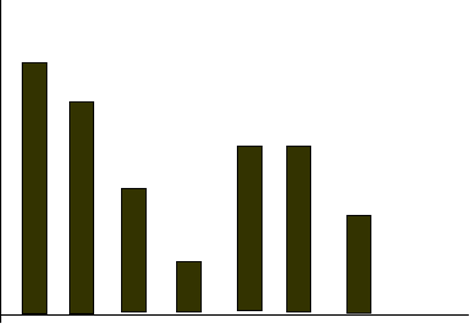 The bar chart of the number of drinks sold in GOODSHEPHERD restaurant
14
12
10
8
6
4
2
0
Coke Fanta Sprite Lemon Pepsi vijuCaprisome
From the above bar chart, the tallest bar s that of the coke, with frequency of 12.Hence the modal drink is Coke
There are other form of BAR CHART, and these are compound bar chart and Composite bar chart.
Compound Bar Chart: It is used to compare two or more set of information.
Example 2: The table below shows how some students are distributed into various campuses in GoodShepherdschool.
Prepare (a) Compound Bar chart and
(b) Composite Bar chart
| CAMPUSES | PEACE | DELIGENCE | SHEPHERD | WISDOM |
| No Of Boys | 20 | 25 | 20 | 20 |
| No of Girls | 15 | 15 | 20 | 25 |
COMPOUND BAR CHART
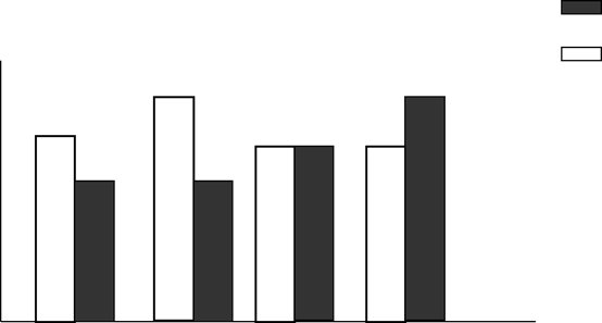 Girls
Girls
Boys
25
20
15
10
5
0
Peace Deligence Shepherd Wisdom
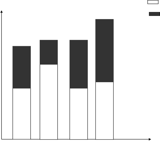 COMPOSITE BAR CHART Boys
50 Girls
45
40
35
30
25
20
15
10
5
0
Peace Diligence Shepherd Wisdom
PIE CHART
This is also known as divided Circles. A pie chart is a circle divided into sectors. Each angles in the sector is proportional to the frequencies. The higher the frequency the higher the Sectoral angles and the larger the sector. To prepare a pie chart,a frequency table is necessary, to display the Variables,Frequecies and the Sectoral angles.
Sectoral angles is given by the formula, FREQUECY X 360
SUM OF FREQUECIES
Students must use a pair of compasses and a protractor in constructing a pie chart, free hand sketch must not be used at all, as each Sectoral angles represent a certain angle, therefore,the angle must be measured accurately with a protractor.
Example 3In a certain school,the lesson periods for each week are as itemised below:
ENGLISH 10; MATHEMATICS 7; BIOLOGY 3; STATISTICS 4; IGBO 3; OTHERS 9.Draw a pie chart to illustrate the information.
Solution:
Step 1: Construct a simple frequency table as shown below;
![]()
![]()
![]() SUBJECTS NO OF PERIODS (f) SECTORAL ANGLES (Degrees)
SUBJECTS NO OF PERIODS (f) SECTORAL ANGLES (Degrees)
ENGLISH 10 10/36 X 360 = 100
MATHEMATICS 7 7/36 X 360 = 70
BIOLOGY 3 3/36 X 360 = 30
STATISTICS 4 4/ 36 X 360 = 40
IGBO 3 3/ 36 X 360 = 30
OTHERS 4 4/ 36 X 360 = 40
![]()
SUM OF (F) = 36
Step 2; construct a pie chart using the Sectoral angles above, with protractor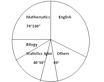
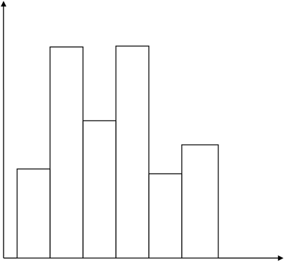
THE HSTOGRAM
: Histogram is a statistical diagram, which involves the use of rectangular bars in representing collected data. The bars in Histogram are also of the same width, while the height of each bar is proportional to the frequency. The bars in histogram are not to be spaced at all, like those of bar chart, as mentioned above. Histogram is very similar to bar chart. The Histogram is mostly used for grouped data.
Example:
Construct a Histogram for the distribution below:
| Class interval | 1 – 10 | 11 – 20 | 21 – 30 | 31 – 40 | 41 – 50 | 51 – 60 |
| 3 | 9 | 6 | 9 | 3 | 5 |
10
8
6
4
2
0
0.5 10.5 20.5 30.5 40.5 50.5 60.5
EVALUATION:
The Table gives the numbers of hours per week allotted to each subject taught at a technical school.
| Subject | Maths | Tech. drawing | Wood-work | Mechanics | Science | Metal-work |
| Hours/wk | 5 | 4 | 2 | 3 | 4 | 3 |
- Represent the information on a pie chart.
- Draw a bar chart to show the information
READING ASSIGNMENT:
From your text book,prepare (i) A composite bar chart
(ii) A compound bar chart.Using any suitable question
GENERAL EVALUATION
- The pie chart represents 24hours in the life of a student
- What fraction of the time is spend sleeping?
- What percentage of the time is spend studying
- If 1hr 20 mins is spent travelling, calculate the value of x.
WEEKEND ASSIGNMENT
- Which of the following is a characteristic of bar chart?(A) The height of each bar is corresponding to the frequency (B) The Variables are respectively proportional to the width of each bar (C) The height depends on the frequency (d) None of the above
- Calculate the Sectoral angle in a pie chart, with the frequency of 10 and Sum of frequency 36 (A) 1000 (B) 360 (C) 3600 (D) 720
- A pie chart is also known as _____________ (A) semi circles (B) Divided Circles (C) Circular graph (D) Angle chart
- Which of the following is not an example of statistical graph? (A) Frequency polygon (B) Frequency curve (C) Ogive (D) Quadratic graph
- A bundle of tally consists ____________ strokes (A) 4 (B) 5 (c) 6 (D) 12
THEORY
1. The number of items produced by a company over a five year period is given below:
| YEAR | 1978 | 1979 | 1980 | 1981 | 1982 |
| NUMBER PRODUCED | 4100 | 2500 | 1500 | 1800 | 9200 |
- Plot a bar chart for this information
- What is the average production for the five year period
2. The table below shows how a company’s sales manager spent his annual salary.
FOOD 30%
RENT 18%
CAR MAINTENANCE 25%
SAVINGS 12%
TAXES 5%
OTHERS 10%
- Represent these information on a pie chart
- Find his savings at the end of the year, if his annual salary was N60, 000. 00