Share this:
4. STATISTICAL METHODS QUESTIONS
The topic entails:-
- Defining statistics
- Identifying types and sources of statistical data
- Identifying and describing methods of collecting and recording data.
- Analysis, interpretation and presentation of statistical data using appropriate graphical methods.
- Explaining the advantages of each method of data presentation.
1. Study the table below and answer questions that follow:-
CROP | 1978 | 1979 | 1980 | 1981 | 1982 |
COFFEE TEA PYRETHRUM MAIZE | 1000 750 300 500 | 990 700 250 450 | 870 650 350 550 | 830 700 400 600 | 840 600 450 350 |
(a) (i) Using 1cm to represent 500 tons, draw a compound bar graph to represent the data.
(ii) Give two disadvantages of using the method to represent statistical data.
2. The table below shows leading import crops by value (Kshs. Million). Use is to answer
questions a – c
CROPYearUn milled wheatMaize Rice Wheat flour 20006,9894,6641,96818020017,5153,3422,61963920025,5772292,10423720036,0991,4172,98116820046,7544,6473,659200 (a) (i) Using a scale of 1cm represents 100,000 , draw a comparative bar graph to represent
the data in the table above
(ii) Give three advantages of suing comparative bar graphs
(b) Explain three reasons why Kenya is a producer of the commodities shown in the table
above yet she imports the same
3. The table below shows milk production in ‘000 units in selected Districts
District198219922002Trans nzoia242640Kiambu232531Meru252732Bungoma121420 a) i) Using a vertical scale of 1 centimeter to represent 10,000 units, draw a compound
bar graph to represent the above given data
4. Study the figure below and use it to answer question 6. The figure depicts proportional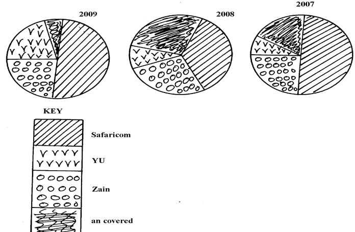 divided circles showing the extend of network coverage in Kenya between 2007 and 2009
![]()
a) i) State four deductions that can be made from the above representation
ii)State three advantages of using proportional circles in representing data
5. The table below shows four principal crops produced in Kenya in the years 2000 and 2001.
Use it to answer questions.
CROP AMOUNT IN METRIC TONS
YEAR20002001Wheat
Maize
Coffee
Tea70,000
200,000
98,000
240,00013,000
370,000
55,000
295,00 (a) (i) Using a radius of 5 cm, draw a pie chart to represent crop production in the year 2000.
(ii) State two advantages of using pie charts.
(b) Calculate the percentage increase in wheat production between the years 2000 and 2001.
6. Study the data given and use it to draw a pie chart showing mineral production in Kenya
MineralAmount (000 tonnes)Gold26Flouspar14Soda ash32Zink28
(a) Using a radius of 5cm, draw a pie chart to represent the above data
(b) List three advantages of using a pie chart in representing data
4. STATISTICAL METHODS ANSWERS
1. a ii) – Relatively more difficult to draw/time consuming.
Long bar not easy to compare.
- Number of components to be represented is limited
- Fluctuation in production over a period of time are not easy to see at a glance
2. (a) ii) – A better impression of totality and individual contribution.
- Differences in quantities are easier to see.
- Easy to read the bars as they start from a common baseline.
- The value of each bar is easily determined.
b) – Kenya is not self sufficient in the commodities due to the high population.
- Frequent drought which lead to crop failure cause food shortage thus importation to supplement local produce
- Increased cost of farm inputs leading to low production hence the need to import.
- Occasional illegal imports/smuggling /hoarding of the commodities creates artificial shortage hence the need to import these commodities.
- Pests and diseases reduce the amount of grain harvested thus the need for importation.
- The requirements to maintain the trading quotas among the countries African trading blocks that Kenya imports some of the commodities in exchange of her own imports
3. a i)
DISTRICT / YEAR | 1982 | CT | 1992 | CT | 2002 | CT |
TRANS NZOIA KIAMBU MERU BUNGOMA | 24 23 25 12 | 24 47 72 84 | 26 25 27 14 | 26 51 78 92 | 40 31 32 20 | 40 71 103 123 |
Milk production in 000 units in selected Districts in Kenya
4. a i) – The year 2009 recorded the highest network coverage in the country
– The year 2007 held the lowest network coverage and uncovered areas respectively
since 2009
- Safaricom network has been the leading in terms of network coverage since 2007
to 2009
- YU network has been the least in terms of network coverage
ii) – Suitable for absolute totals in different periods
- Gives a good visual impression of the totality
- Easy to interpret
5. a ii) – It’s easy to compare the various components within a circle.
- They are simple to construct after angles have been calculated.
- Give clear visual impression of individual components.
– It’s easy to determine the value of each component since the size, the sector is
proportional to the value it represent.
b) = 130,000 – 70,000 = 60,000 √1 mk
% increase = 60,000 x 100 = 600
70,000
= 85 5/7 % √1 mk
6. a) Gold = 26/100 x 360 = 93.6 = 940 1
Fluorspar = 14/100 x 360 = 50.4 = 500 1
Soda Ash= 32/100 x 360 =115.2 =1150 1
Zinc= 28/100 x 360 = 100.8 = 1010 1
b) – Good in showing variant types of data
- Easy to draw
- Easy to interpret
- Easy to make comparisons